Pretty Stylish London Summary
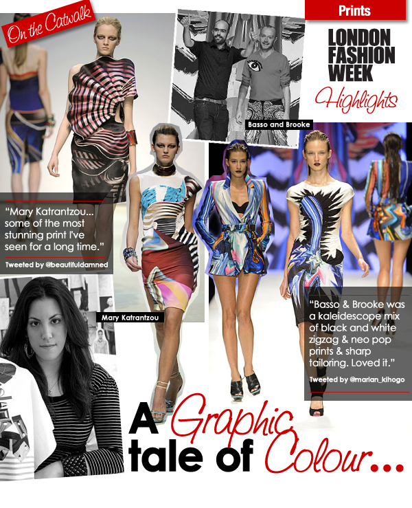
It was a battle of the prints this week as Basso & Brooke and Mary Katrantzou lit up the catwalk. Both labels treated the fashion week crowd to kaleidoscopes of colour and pop graphics. Whilst Katrantzou's inspiration came from artisanal blown glass and the aesthetics of perfumery, Basso & Brooke remained inspired by the playful and subversive.
True to form, Basso & Brooke's designs indulge us in a dynamic prism of colour. Yet their print work has evolved somewhat to a more sophisticated balance of fantasy and reality. Katrantzou has obviously found influence from Basso & Brooke in her own work, however she achieves a completely different feel. Her prints are more free-form, more organic with a reference to nature.
Graphical pop-colour prints will undoubtedly be a huge trend for Spring/Summer, and the accessories at Katrantzou showing designed by British master of art glass-blowing, Peter Layton will most likely be reworked for the high street.
Credits:
Images courtesy of www.londonfashionweek.co.uk
@beautifuldamned twitter.com/beautifuldamned
@marian_kihogo twitter.com/marian_kihogo


0 comments:
Post a Comment